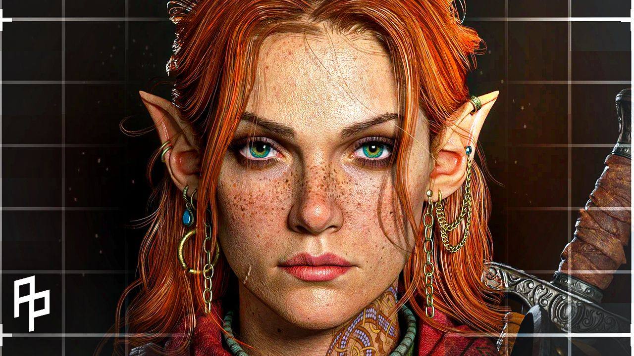
I want to zoom in on one specific moment from my Pixel Peeps conversation with Rodrigo about his stylized character, Silky Jessie.
It was all about lighting.
He told me he was used to approaching lighting in a physically believable way. One main light. Natural falloff. Something grounded in realism. But that approach wasn’t giving him the illustrated look he wanted.
Instead of simulating light, he started designing it.
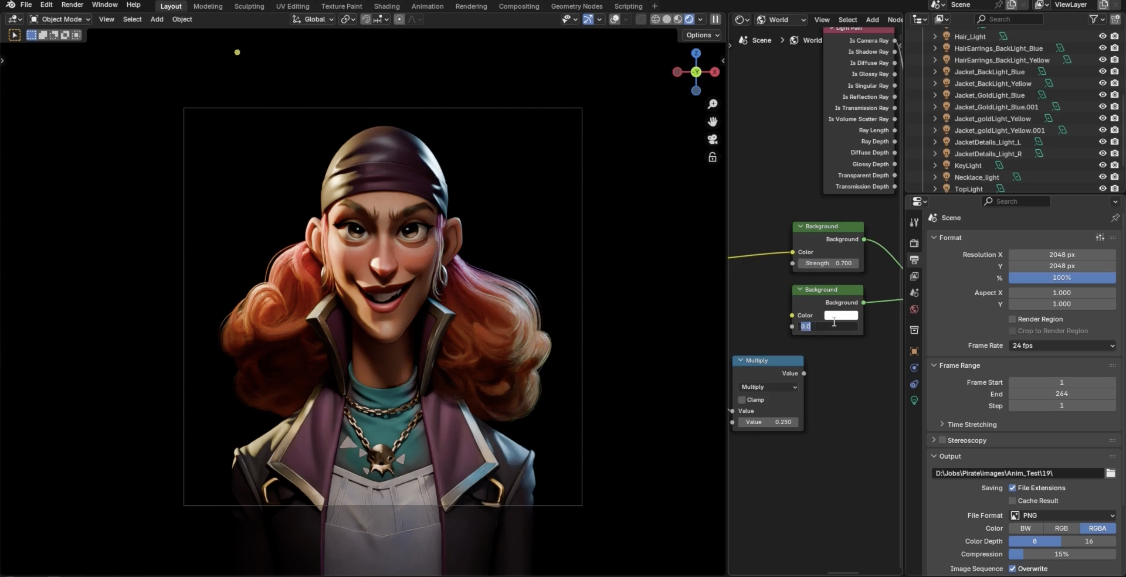
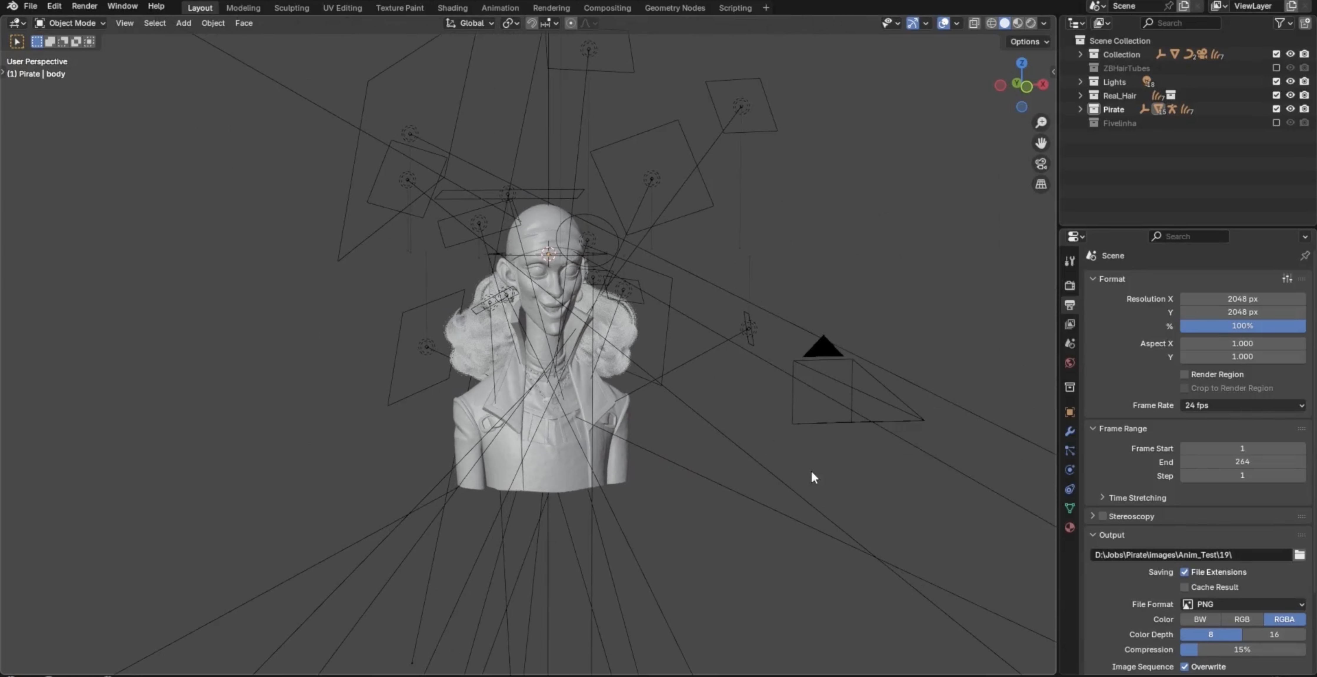
He didn’t rely on a single key light. He began placing multiple lights intentionally to shape specific areas of the character. The face needed different treatment than the bandana. The jacket needed separation from the hair. The necklace needed to catch highlights without blowing out the rest of the scene.
In the end he ended up using 12 lights... <- make this a real number
He used light linking to isolate regions so that certain lights would only affect certain parts of the model.
Once he stopped asking, “Is this physically correct?” and started asking, “Does this read the way I want?” the piece began to feel illustrated.
Instead of letting the renderer decide how light should bounce, he manually controlled where attention should go. He built contrast where he needed it. He kept other areas flatter. He adjusted until the character read clearly from a distance.
Stylized work often fails because we light it like realism and hope the stylization carries through on its own. But illustration lighting is designed. It’s selective. It’s intentional.
You have to decide what the goal is.
If the goal is physical accuracy, light behaves one way. If the goal is graphic readability and mood, you might need to break realism to get there. And it’s a reminder that sometimes the biggest improvement doesn’t come from adding more detail.
It comes from changing how you think.
|